TL;DR
Behind every dashboard is a hundred tiny product decisions⏳.This project is about making the right ones.
Type
Duration
Design focus
Context
OXRED is an enterprise platform that helps businesses monitor and manage electric vehicle fleets using real-time telemetry from IoT devices. While the initial scope was translating early product concepts into production-ready designs, the role quickly evolved into identifying workflow gaps, defining interaction patterns, and creating a consistent experience across 12+ interconnected modules.
The Context
As electric fleets continue to grow; from taxis and buses to commercial delivery vehicles; operators need to monitor far more than just a vehicle's location. Battery health, charging behaviour, trip history, maintenance schedules, alerts, efficiency and hundreds of other data points all influence how a fleet performs on a daily basis.
OXRED brings this complex vehicle telemetry into one unified operational platform.

Vehicle Telemetry
IoT devices continuously collect telemetry from every vehicle.

OXRED Platform
Complex telemetry is organised into dashboards, reports and workflows.
Operational Decisions
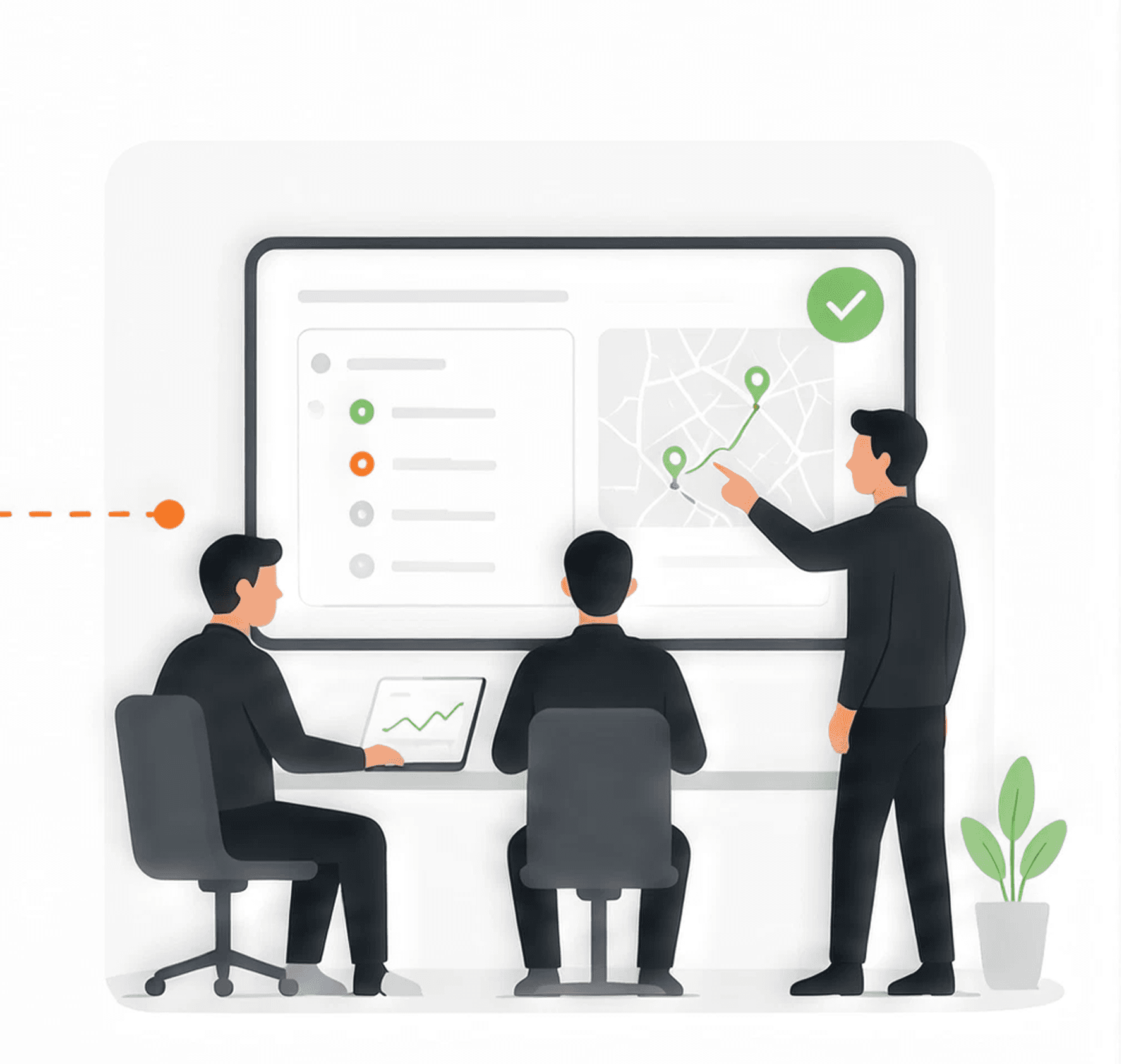
Fleet managers use these insights to monitor & optimize their operations.
My Role
The business had already identified the data available from its IoT devices and outlined the platform's modules. I started by translating these concepts into production-ready designs, but the role quickly evolved into defining workflows, resolving product ambiguities, identifying edge cases and creating a consistent experience across the platform.
MONTH 1 - PHASE STARTED WITH
Translate early concepts into product-ready workflows
MONTH 2 - ROLE EXPANDED INTO
A product-thinking partner to Engineering dept. & PM
01
Resolving workflow ambiguities
02
Identifying crucial product gaps
03
Improving information hierarchy
04
Designing consistently scalable patterns
MONTH 6 - ROLE CONVERGED TO
Maintaining consistency across the platform
The Challenge
Every module solved a different operational problem; vehicles, rides, maintenance, alerts, sustainability, finance and more. Each module also had its set of sub-modules which were also inter-related. While each workflow had unique requirements, the product still needed to feel like one coherent system.

12+ Core Modules
Covering every aspect of Fleet Operations
30+ Sub Modules
Purpose built views and workflows
1 Unified Platform
Consistent experience throughout
Rather than walking through every module, I've highlighted one product decisions that best represent how I approached ambiguity, scalability and operational usability across the platform.
Problem : Scaling analytics for growing fleets.
The dashboards and the interactions were designed for tens. Fleets ship in hundreds. Several modules: Rides, Reports, Vehicle comparisons; let users select multiple vehicles at once. The pattern worked in prototypes with twelve trucks. It did not survive contact with a real 300-vehicle logistics fleet. So the problem was:
How do you select and compare hundreds of vehicles without punishing the manager or the browser?

Large Fleet
100s of vehicles
Selection becomes tedious
Analytics become expensive
What we observed?
Managers were selecting the same 8–10 vehicles every morning; one by one, from a list of 300. The interaction was correct for the demo dataset. It was wrong for the customer.
TL;DR - A pattern that doesn't scale, is a bug in production
Before drawing anything, we sat with the questions.
These are the trade-offs the design has to answer; before choosing a control, a modal, or a limit. Get these questions right and the interface almost designs itself.
How many vehicles should users compare at once?
Every fleet has a "shift" of 8–20. Beyond that, comparison stops being visual.
Should analytics support unlimited selections?
Or does "unlimited" quietly mean "unusable + slow"? And how do represent these selections?
How do we reduce repetitive selection?
Operators pick the same set daily. The product should remember what they mean.
Can exporting behave differently from visualisation?
Reporting wants completeness. The screen wants clarity.
Solution 1 - Vehicle Groups & Classes
Selecting vehicles one by one doesn't scale when a fleet grows into hundreds. Instead of asking managers to repeatedly build the same selection, we looked at how fleets are already organized in the system.
So instead of making multi-select faster, we made it smaller.
Through our account managers working with each client, we identified that vehicles can be categorized by attributes such as vehicle group, class, make and model. We used those existing relationships to turn a long vehicle list into smaller, reusable subsets.

Idea
Vehicle Groups & Classes
Persistent, user-defined subsets. Operators pick a group in one click, not fifteen.

Implementation
Multiple Filters
Saved groups persist across modules. More filters, more accuracy; lesser selections.
Fleet managers could narrow the fleet using groups and classes before selecting individual vehicles, reducing the cognitive load of working through a large list and making recurring selections easier to manage.
This was the first step: Reduce the cognitive load on the user
Solution 2 - Cap interactive comparison
Once filtering had reduced the fleet to a relevant subset, we still had to decide how many vehicles could be compared on screen at once. We discussed typical selection sizes with our account managers and worked with the technical team to understand where larger datasets began affecting responsiveness and visual consistency
We realized that multi-select needs an upper limit for the data to be visually valid
Through those discussions and testing, we found that 15 vehicles was a practical upper limit - enough for meaningful comparison without compromising readability or responsiveness. This aligned with the point where comparison charts started losing visual clarity

Idea
Selection Limit
15 vehicle selection limit. Above that, comparisons stop being visual. Analytics stays responsive.
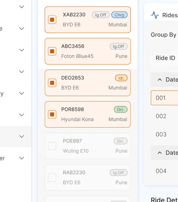
Implementation
Max. 15 Selections
Once the max. of 15 vehicles are selected, the rest of the vehicle selections get disabled.
By limiting the number of vehicles shown at once, fleet managers could still compare a meaningful subset without overwhelming the interface or slowing down the experience. The full fleet remained accessible through filtering and exports when broader analysis was needed.
This was the second step: Balance analytical depth with usability.
Solution 3 - Separate analysis from export
Once we limited interactive comparison to 15 vehicles, we still had to support operators who needed access to the complete fleet dataset. Increasing the selection limit would have solved that technically, but it would bring us back to the same problems of visual clutter and performance.
We realized that complete fleet data didn't need to be visualized to be useful.
Instead, we separated the two jobs. The platform could stay focused on interactive analysis of a manageable subset, while managers could download the full fleet data when they needed it for reporting, deeper analysis or offline work.

Idea
Options in Export
Download selected vehicle data or download all vehicles data. Choice provided always.

Implementation
Download Options
Download selected vehicle data or download all vehicles data. Choice provided always.
Fleet managers could use the platform for focused analysis without losing access to the complete fleet data. Interactive views stayed manageable, while exports handled broader reporting and offline analysis.
This was the third step: Keep the interface focused without limiting access to the data.
Solution Overview
Three decisions. One focused experience.
Groups for speed, comparison for depth, export for completeness.

Reduce search effort
Multiple Filters
Saved groups persist across modules. More filters, more accuracy; lesser selections.

Cap interactive comparison
Max. 15 Selections
Once the max. of 15 vehicles are selected, the rest of the vehicle selections get disabled.

Separate export from view
Download Options
Download selected vehicle data or download all vehicles data. Choice provided always.

Together, these decisions kept the interface fast and focused without limiting what fleet managers could do with their data. The solution wasn't to limit the fleet. It was to limit what the interface had to handle at once. Groups helped managers find the right vehicles, comparison kept analysis manageable, and exports preserved access to the complete dataset.
Where this stands
OXRED is currently in production. Early client reviews; relayed through our account managers have been positive on the redesigned experience, though there's no hard usage data yet at this stage as of 05 Aug 2026.
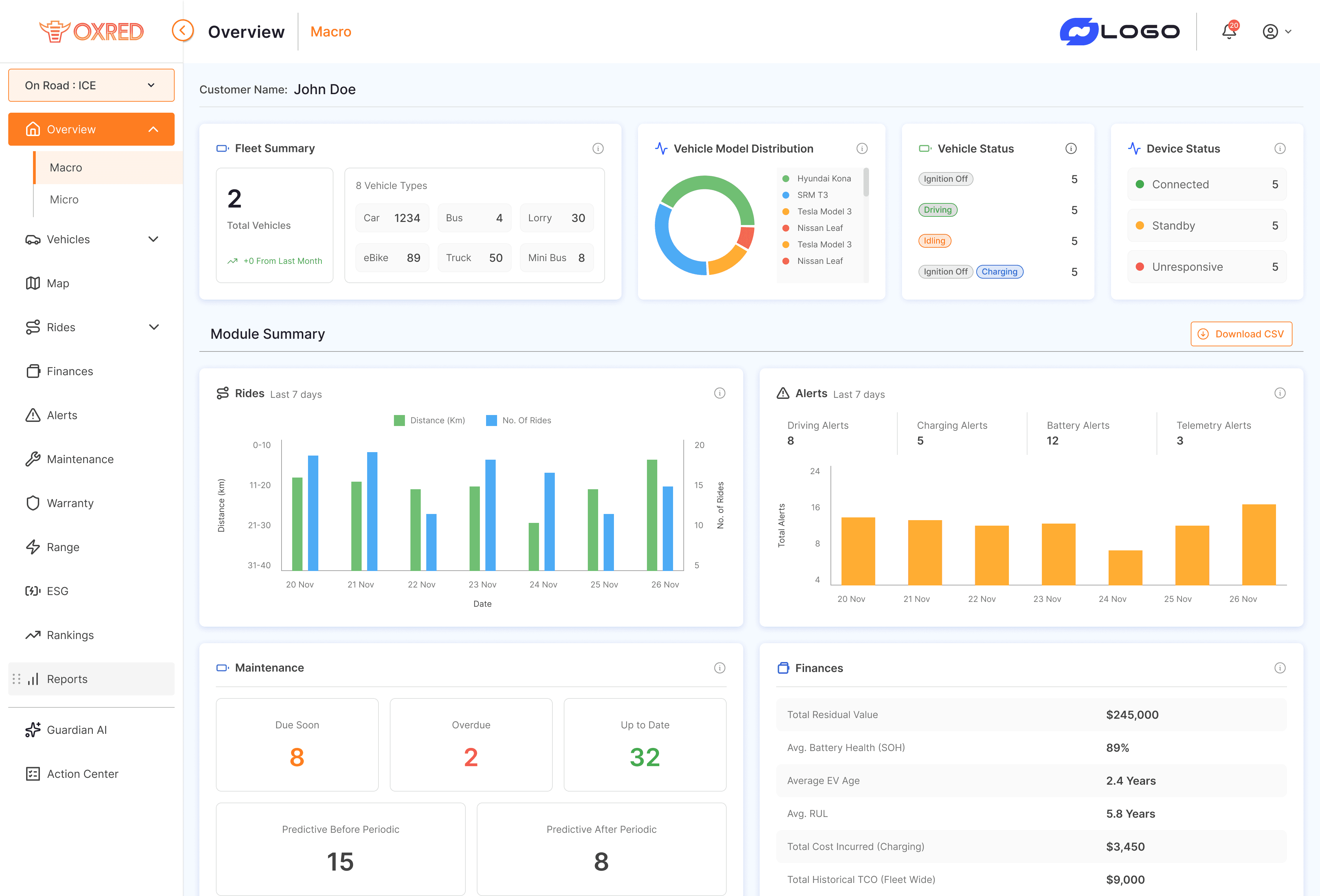
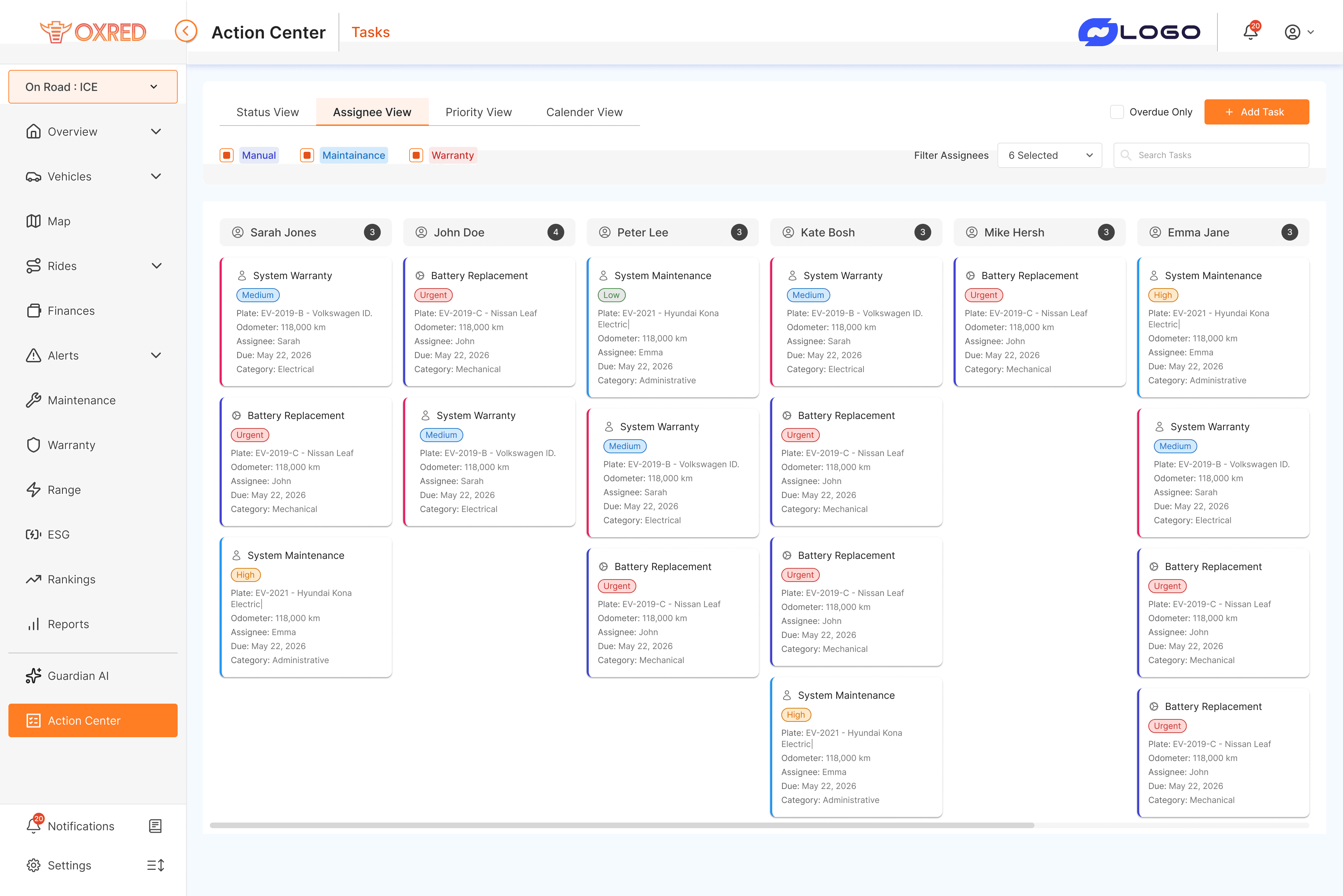
I worked on OXRED as the sole product designer on this contract engagement. These three decisions are one thread out of many. Across 7 months and 12+ modules, I designed 30+ screens resolving dozens of similar workflow ambiguities. This case study highlights one, because the pattern mattered more than the fleet, get the reasoning right once, and it repeats across the platform.
Consistency in solving ambiguity across all the modules.



"If you've reached till this point, we probably have a lot to discuss….